 This NME magazine cover uses bright fonts to catch people’s eye. NME usually uses rather simple, masculine colours and fonts on its cover. The fact that this issue is ‘introducing the new NME’ could mean that they magazine may not have been appealing to as many females as they had hoped and expected. The fact that there are 10 different covers available means that the magazine can appeal to as many people as possible, as there is bound to be at least one artist out of 10 that music fans will be interested in. There is not much text on the cover, and the background is plain, which puts focus on the image of the artist and suggests that they are all about the music. The magazine is £2.30, which is sensible considering it is a weekly magazine and any more than this may be too much for people to want to pay every week. The price and barcode have been put in small subtle fonts so as not to distract readers from the main focus. If the magazine can make people certain that they want it before they see the price, then they are more likely to be willing to pay for it. The artist's nail varnish and lipgloss match the colour of the title and headline, making the cover look more attractive and desirable. The quotation that the artist gives is quite honest and revealing, which makes the target audience curious and makes them want to buy the magazine to learn more.
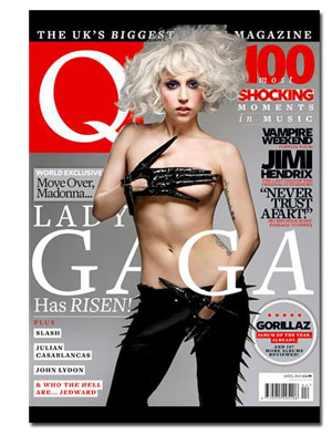
This Q magazine cover uses a different method to draw readers in. It mentions a number of different features that will appear in the magazine, rather than focusing on the artist only. They could have done this in the hope of convincing people that they are getting more for their money. It mentions that it is ‘The UK’s biggest music magazine’, making it sound like it is the best and most popular, however ‘biggest’ could be interpreted in a number of ways and has no clear meaning. The colour scheme and fonts are quite masculine, suggesting that its target audience are mostly males. Another thing which would suggest this is the fact that the artist is topless, which would attract far more men than women. This magazine is more expensive than NME at £3.90, but is a monthly magazine so some would argue that it is better value for money.Similarly to NME, the artist is stood in front of a plain background, making them stand out. The price and barcode are also in a smaller font to ensure that people have a chance to get a good look at the main features before they see the price. This is something which is typical of pretty much every magazine.
No comments:
Post a Comment