Thursday, 24 March 2011

Finished Products


Forms and Conventions

In what ways does your media product use, develop or challenge forms and conventions of real media products?

Conventions are features which appear in all magazines  such as a front cover, contents page, a main front cover image, cover lines, a price, a date and a barcode. They exist because they are widely recognised and understood to be the normal way of things, so now they are what consumers expect to see.
Example:


These magazines differ completely in genre. Bliss is a magazine aimed at younger/teenage girls (age 10-15) and it talks features teen-friendly celebs, gossip and high-street fashion. Whereas Kerrang! is a rock magazine which is aimed at mainly males (although is read by females too) who enjoy metal/rock music (age 15-30). Although  these magazine genres are totally different, they still keep to the typical conventions of the magazine industry. The both have the masthead in a clear, large font at the top of the page, they both have a large image in the centre of the page, they both have coverlines surrounding the image and both have a barcode in the bottom right-hand corner of the page.


My Magazine
 I took the task we were given of designing a music magazine, and put my own spin on it to make it more 'out there' and more interesting. I also wanted to make sure that I was doing something I knew I could produce well. I decided to produce magazine that is a fusion of indie/rock music and high-fashion. I chose to do such a specific genre because I wanted to push the boundaries, which have previously not really been attempted by many in the magazine industry. I took influeneces from the music magazine Nme, and high-fashion magazines such as Pop and Love. I looked at a number of my covers from the magazines I took my inspiration from to help me decide what I did and didn't want to do with mine.
I liked the simplicity of this cover, but felt that the name of the magazine was not displayed clearly enough for people to remember. Although you could argue that those who buy this magazine regularly know it well enough not to need to understand the name.I like the general layout of this magazine, because it puts emphasis onto the person on the cover.  I was surprised that there was no barcode. The producers probably did this to make the cover look more 'high-fashion', but realistically retailers are less likely to want to stock a magazine they can't simply scan quickly


I felt that this cover was too simplistic, as it wasn't giving people enough of an idea of what was inside. Also, I didn't like the way that the magazine name  had been partly covered by the main image. I liked the font used towards the bottom of the page, because it looks elegant and gives the magazine some personality. However similarly to the 'Pop' cover, there is no barcode, which in this magazine's case, makes it look soplain and simple that it barely looks like a magazine cover.


I liked the general layout of this cover for a music magazine but, seeing as my magazine also focuses on fashion, I felt that there would be too much text if i chose to base my cover on this. Also, I noticed that with most fashion magazines, the cover image is taken in front of a white, plain background, so the image would be no good for my magazine genre. I felt that the large fonts used all over the page took emphasis away from the artist.

I called my magazine 'Shockwave' because I associated the word 'shock' with the reaction of people when a new controversial fashion-line is seen for the first time on a runway.I associated the word 'wave' with the reactions given from a crowd at an indie/rockmusic gig. Seeing as my magazine combines the fashion and music, I thought it would be a good idea to infuse these two words together.


On my magazine cover I chose to use a barcode because it is more likely that retailers will want to sell it, if sales assistants can just quickly scan it, rather than having to type in a product number or price. I chose my main font because the simplicity of it seemed very high-fashion. I chose to make the masthead font large enough size to attract my target audience's attention, and make the magazine name stick in their minds. A feature I used, which I had noticed on many fashion and music magazines was to have the masthead covering the photo of the artist slightly. I  did this so that either the masthead or the artist's face were noticed first by my target audience, and once they had seen one, they would look straight up or down to the other. I put my dateline directly underneath my masthead because this seems to be a feature typical of all magazines. I used purple font for alternate coverlines and the name of my featured artist just to bring the page to life with colour in a simplistic way. I chose to put a quote on my cover which I felt summed-up the overall attitute of the arist and was also interesting enough to draw people in.


I chose to photograph my friend Em because I felt that she had the right amount of attitude to pull off the artist I wanted to portray, which would be what my auidence would expect to see on a rock or indie music magazine, but at the same time she had the beauty my target audience would want and expect to see in any fashion magazine. At first I used the image from my front cover in my feature article instead, but then once I looked at a few more magazines, I felt that the simplicity and the attitude of the image would give my cover the simple elegance I wanted for it.


My double page spread stuck to the conventions you would expect for a high-fashion magazine, It was very simplistic. I kept the number of fonts used to an absolute minimum. I put my image and the actual interview on separate pages, because I did not want either one to take attention away from the other. I chose to do an interiew as opposed to an article because I wanted readers to be able to get a real idea of what the artist was like, this is a feature typical of most music magazines. I  used swear words in my interview because I really wanted to capture the controversial and outrageous nature of the artist I was portraying, and I knew that this would appeal to those who are fans of outrageous and controversial fashions and/or music. I gave my interview the title 'Glitterazzi'. Glitter, being a reference to my artists make-up taste, and 'azzi' to be a take on paparazzi which which we associate with chaos, madness and of course fame.


I wanted to keep my contents page incredibly simple, to keep the focus on the content of the magazine, I took my inspiration from a Vogue contents page, and then simplified it even more. This was the only time I took inspiration from Vogue rather than Pop, Nme or Love.I used two images of my artist. One from the photoshoot to give readers a greater idea of what's in store, and one from 'behind the scenes' of the photoshoot to show readers a different side of the artist. I wrote an Editors Note to create the illusion that I was adressing each individual who read it, to make it seem more personal which would encourage people to buy it again.

Representation

How does your media product represent particular social groups?

When decided to make my magazine a hybrid magazine to represent a very specific, and therefore small, social group. I wanted to represent aspirers who are always the first to be up for trying something new and adventurous, whether that would be listening to an upcoming band or trying out a new controversial fashion before anybody else. I understand that when trying to appeal to a small section of society, there is always the risk that it is not going to be well-recieved by as many as you had hoped. However, those who do take an interest in the magazine will appreciate it that much more for being the only one of its kind.

I wanted to give the Indie/Rockers whose music taste would be represented in my magazine, the latest and most trendy fashion ideas, because they would most likely want to be the first to try these ideas to keep their status as an 'indvidual' fresh. Hopefully my magazine would give them the inspiration to go all out and show those who look down on them that the 'indie' subculture isn't just a cliche, and that there are still some people who are daring enough to set trends rather than just supporting them.


I wanted to choose an artist for my article that wasn't sterotypically fashionable and didn't really fit in to the indie/rock genre to push the boundaries of what  is acceptable and expected, and what isn't. However I did want the artist to be well-known for their music and dress sense.I wanted shock my target audience by showing them a different side to somebody they thought was one-dimensional. It was for this reason that I chose Ke$ha. She is well-known for looking like she never makes an effort when it comes to fashion, and I wanted to show people that it isn't neccessarily a bad thing. Her lyrics are well-known for being rather controversial, which I thought would appeal to the 'indie' subculture, who are always looking for rebellious things to partake in.

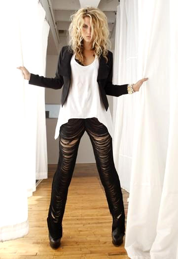
I looked at a number of different magazines and online photo shoots that Ke$ha had featured in to see how she had been represented. I found the picture above on Ke$ha's official website and found out that it had featured in an American issue of Vogue. The photo had the simple elegance I wanted for my magazine, but seeing as it was originally taken for a magazine that is simply all about fashion, I wanted to show slightly more of the rock edge that Ke$ha is known for. I liked how the white background and wooden flooring created a plain setting to make the main focus of the object (the artist) stand out. I chose to have Em sitting on the floor in my take of the photo with her leg up to display more of an animalistic nature to draw people in. I liked the way that Ke$ha had been styled. The simplicity of her outfit made her look beautiful. I decided to dress Em in black leggings and a black jacket too. However I felt that simply copying the style in the photo would not help me get the ideal attitude my image really needed to display, so I decided that Em should only wear a bra underneath her jacket (an idea I had taken from another photo of Ke$ha) to show the care-free attitude my audience would be expecting to see.

I chose to take my photo from a high angle (but not too high) so that I could have Em looking up and directly at the camera. I did this to show that she is not about to back down to people who try and make her feel small, and to give the feel that she is adressing the audience. This shows her as a powerful woman, who is completely in control.

I think that I have reinforced the sterotype of my magazine through my photos. They show that anybody can be beautiful if they are brave enough to be different. And it's not just the stereotypically 'perfect' people who can appear on magazine covers.Being a fashion and music magazine, my magazine would obviously have a pro-comunist stance  because it would be showing many different clothes/shoes/bags/jewellery/albums/songs  and giving a  price  and telling people where to buy them. My magazine would also be quite full of adverts, but only adverts that follow the genre of my magazine, so they would be for high-fashion labels (such as Chanel, Gucci and Prada) and for new album releases for indie/rock bands (such as White Lies, Kids in Glass Houses and The Strokes)

Institutions

What kind of media institution might distribute your media product and why?

I would not want a huge company such as Bauer to publish my magazine. Although they could help me to get my magazine on to shelves in chain stored such as WH Smith (the largest magazine retailer in the UK) for it to be widely seen, I feel that they would take control and take away some of  the editorial rights which could result in the independence and individuality my magazine represents being taken away. Aswell as this I would not want my magazine to be so easily available to just anyone.I would rather only sell my magazine in areas where those who would appreciate it most are likely to spend time.

Many of my target audience would most probably smoke, either to fit in with their sterotype or due to the stress of their middle-class jobs. For this reason I would sell my magazine in newsagents in cities where they are likely to stop at for a pack of cigarettes on their way to/from work. My audience would probably visit vintage shops as well as high-street shops such as Topshop to ensure that they keep up their 'indie' status, so I would also want my magazine to appear on shelves in newsagents in more low-key areas, where you would expect to find most vintage stores.

I would want a smaller company such as the Dazed Group to publish my magazine, because they are independent and produce less-known magazines such as Dazed & Confused and Another Magazine (a bi-annual fashion magazine which sells over 100,000 copies and has equal male/female readership). The company makes their love of  fashion very clear and do so in their own way. Their magazines feature unusual styles, which are well received by their quirky audience. They also produce one of only fashion magazines that has an equal female/male audience, proving that even though they are only a small company they can achieve things that have never been done before. I think that the Dazed Group would be very interested in my magazine, because they are clearly interested in fashion, and like to be different, so may find my hybrid magazine very interesting and impressive.

Target Audience

Who would be the audience for your media product?

Audience Profile:

Shops: Topshop, Vintage, H&M, HMV, Boutiques, Record Shops
Products: Skinny Jeans, Converse, Bed Head hair products, Coffee, Lipstick, Floral Dresses
Music: Editors, White Lies, Bob Dylan, The Strokes, The Smiths, The Cure
Hobbies: Gigs, House Parties, Shopping, Socialising at pubs and cafes
Films: Classic horror movies, The Breakfast Club, St Elmo's fire, Juno
Habits: Smoking, Swearing
Attitude: Easy going, care-free, daring
Aspirations: To be able to afford clothes by designers such as Chanel, Marc Jacobs and Vivienne Westwood
Location:  City. In a cluttered busy flat or townhouse where work can be easily accessed.
Transport: Buses, the underground. Taxis when on a night out, train when visiting family who live far away.
Job: Vintage shop/ boutique owner. Office worker.
Ideal Holiday: New York, Amsterdam, Berlin, Tokyo

My target audience should buy my magazine because it is the only one which combines both their love of 'indie' music and their love of 'different' fashions. It will give them ideas on how they can keep up their 'individual' image to break the ironic sterotype they are given of all looking the same. They will also get to hear their favourite band/artists takes on fashion and their own images for inspiration.


Addressing My Audience

How did you attract/address your audience?


My product speaks in the language of my target audience because they are the types who like controversy (as is apparent in their lifestyles, fashion sense and taste in more 'quirky music), however they are also contradictions of themselves as they claim to be 'different', but by all claiming this they blend in to one sub-culture. Ke$ha is a controversial character because of the way she presents herself (through her style and stage presence), the raunchy messages that her song lyrics give and the outrageous things she has been known to say in the past, and it is for these reasons I thought that she was perfect to appeal to my target audience. Also, Ke$ha is not the sort of person my target audience would expect to see on a magazine aimed at them, so I would be seen to be pushing the boundaries of what was stereotypically correct for different social groups in society and I think that my target audience would see this and appreciate it. I hope that it would expand their understanding of what it means to be 'different', so that hopefully a little more diversity could be created amongst people in that group, as well as reinforcing the stereotype.


Throughout this task, i have asked a number of people I know who I would consider to be very true to my target audience what they thought of changes I made to the cover, contents page and double page spread. I carried out a survey on  10 people who read both Vogue and NME, which focused on the layout. I asked 'Do you think that they layout of my magazine has the right balance between a Vogue layout and an NME layout?'. I left a box at the bottom where they could write whatever they thought in detail, rather than just giving 'yes/no' options, as i wanted to know how I could improve in as much detail as possible to get it spot on. The general feedback was that everything was perfect, other than the contents page, which 7/10 people said was too complex and did not look elegegant enough to represent fashion as well as music. After recieving this feedback, I removed an uneccessary text, made my background white and used a more 'simple' font, just as it had been suggested in the survey.


I think that it was critical to my finished product's success that I carried out surveys like this, because sometimes your own interpretation can be different as it is your own work. Also, I do not sterotypically fit in to my target audience's category, so I would have found it hard to get everything perfect for them in their eyes without some outside advice from people who are ideally my target audience.

Technologies

What have you learnt about technologies from the process of constructing this product?
When creating my magazine, I used different softwares to create different pieces of work. My actual magazine  was done on Photoshop, and then I put my work on show  on websites like Flickr and Blogger


At first I did not enjoy using photoshop because I had never used it before and found it hard to get the hang of. However once I had practiced with my preliminary task, I enjoyed using photoshop.  I was struggling with certain things, such as using various lighting tricks, but I worked hard to make sure I knew how to use them well because I was determined to make my magazine look professional.  Photoshop is good software which is available to amateurs as well as professionals, and it felt really good to know I had taught myself how to use it. I was rther proud of my magazine once I had finished,as I had tried so hard to make it as perfect as possible.


I used Flickr to analyse articles and covers for my planning and preliminary task. I had a lot of problems when using Flickr because, it would allow me to open up my image and then when I went to annotate it, it would delete all the text once I had typed it and tried to 'save' it. This was incredibly frustrating. I had Safari at home, so i had to do all of my work on Flickr outside of college, which was inconvenient.However, once it was working it enabled me to produce a higher-standard of work more easily than I could have done without it.


Blogger is a good website for many reasons.  It allows to you upload pictures and other things into a blog and write about them, or just write blogs, and with no word limit you can talk as much as you want. I found that spell check didn't work, and it was very difficult to get pictures to align with the text or go where I wanted them to. It was this that I found the most frustrating out of the whole of this task. However I had no problem accessing blogger on Internet explorer like I did with Flickr. Learning new skills with photoshop, as well as the ones i already knew, i think was the reason my magazine was such a success. I'm also glad I picked up new photoshop skills, i liked learning how to lay things out in a professional manor as Blogger enabled me to.